The Shift Toward Softer Color Palettes in Living Room Design
If you’ve been browsing interiors lately, you’ve probably noticed a subtle shift happening. Living rooms are starting to feel calmer, lighter and a little more relaxed than they used to. The bold contrasts and sharp tones are slowly giving way to something softer. And honestly, it makes sense.
The move toward softer color palettes in living room design isn’t just about trends. It reflects how people want their homes to feel now. More comfortable, more personal and a bit more grounded.
Why Softer Palettes Are Taking Over
For a long time, interiors leaned heavily on cool grays and stark whites. They looked clean and modern, but they didn’t always feel warm.
Now, people are looking for something different. A space that feels lived-in rather than styled. A place where you can actually relax at the end of the day. That’s where softer tones can help.
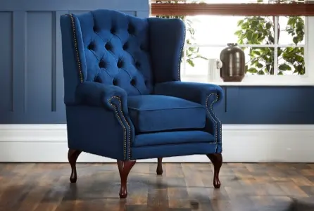
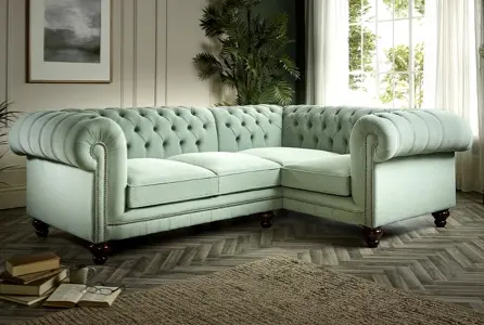
Think warm beige, muted taupe, soft sage, dusty blue. These shades don’t demand attention, but they quietly shape the mood of the room. They make everything feel a bit more settled.
It’s less about making a statement and more about creating an atmosphere.
The Rise of Warm Neutrals
One of the biggest changes in living room color trends 2026 is the move toward warm neutrals.
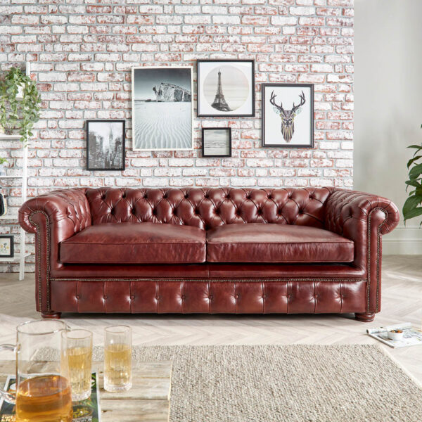
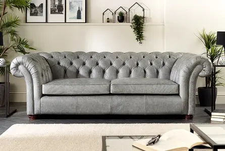
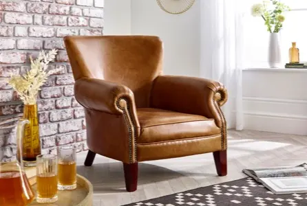
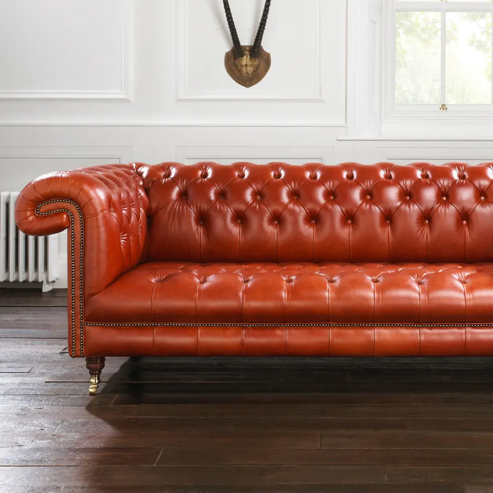
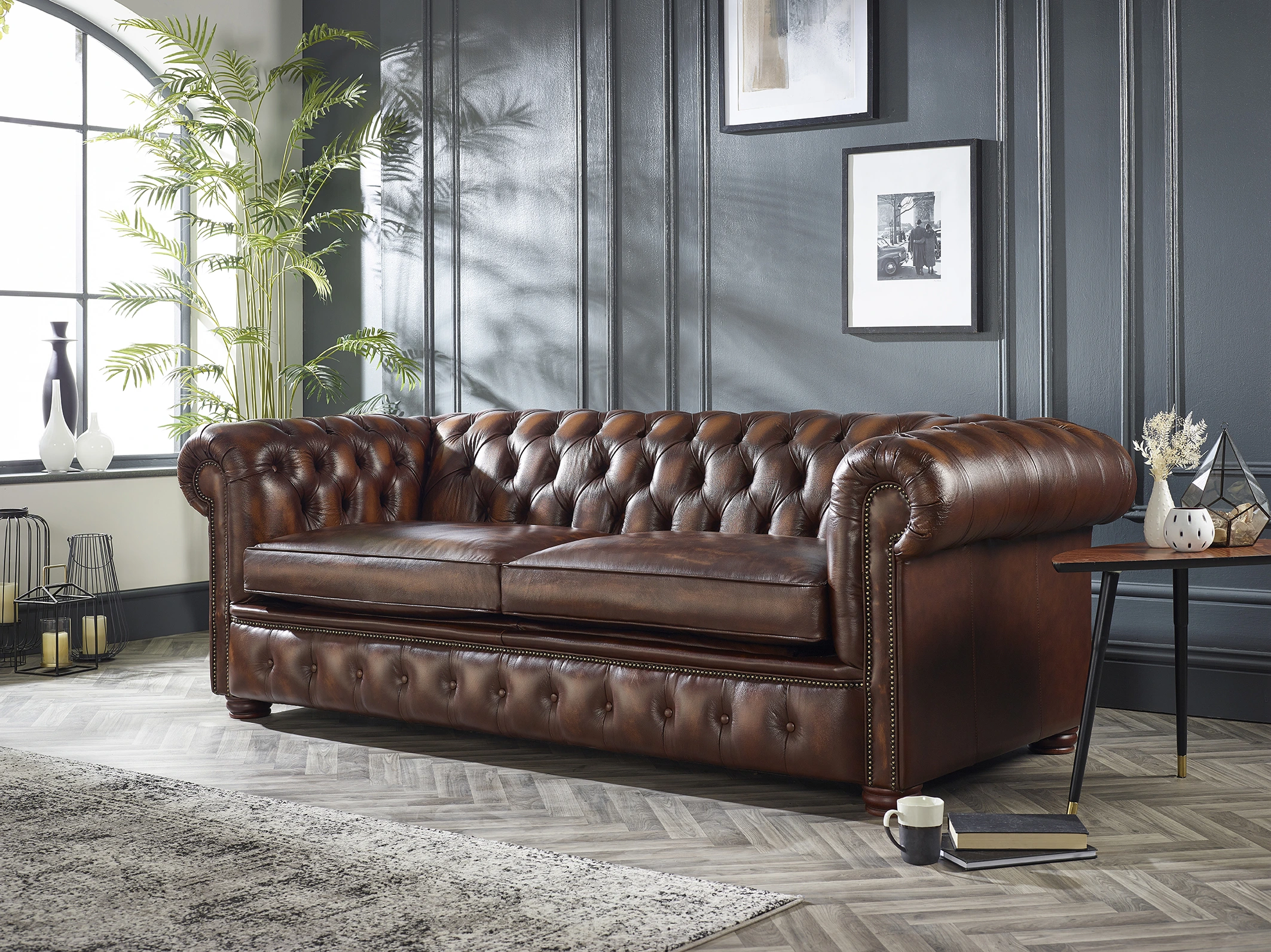
Instead of cool gray walls, you’ll see more creamy whites, sandy tones and subtle earthy shades. These colors work well with natural materials like wood and leather, which is why they pair so naturally with classic pieces like a Chesterfield.
They also have a way of softening the entire room without making it feel flat. And the best part? They’re easy to live with. You don’t feel the need to constantly update or refresh the space.
Layering Tones Instead of Contrasting Them
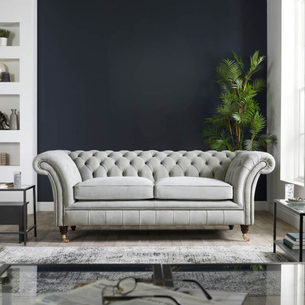
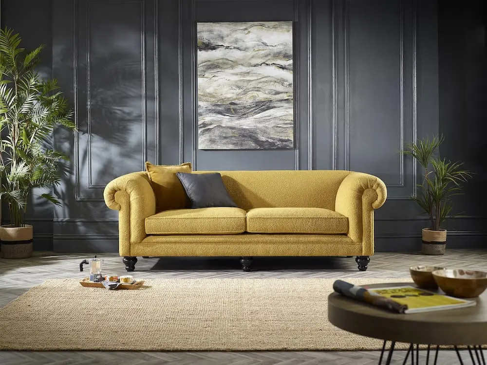
Another thing that’s changed is how people use color. Instead of strong contrasts, there’s more focus on layering similar tones. A warm beige sofa, slightly lighter walls and soft textured cushions in the same family of colors. It might sound simple, but it creates depth without being overwhelming.
This approach works especially well in a neutral living room where texture plays a bigger role than color. Linen fabrics, wool throws, wooden finishes, they all add interest without needing bold shades.
It’s a quieter kind of design, but it feels more natural.

Creating a Calmer Space
There’s also a practical reason behind this shift.
Homes are no longer just for entertaining. They’ve become places where people work, unwind and spend most of their time. Because of that, the environment matters more than ever.
Softer palettes naturally support calming interior design. They reduce visual noise and make a space feel more open. You walk into the room and nothing feels too sharp or distracting. It just feels easy.
How Furniture Fits Into This Trend
Furniture plays a big role in how these palettes come together.
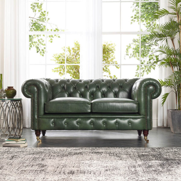
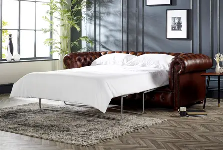
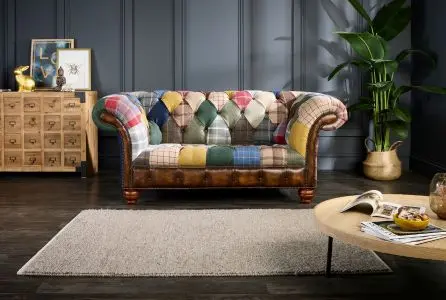
A leather Chesterfield, for example, fits surprisingly well into a softer scheme. The richness of the leather adds depth, while the surrounding lighter tones balance it out.
It’s the same idea with fabrics. Softer color palettes allow texture and craftsmanship to stand out more.
Instead of everything competing for attention, each piece has space to breathe.
Adding Subtle Color Without Overdoing It
Of course, softer doesn’t mean boring.
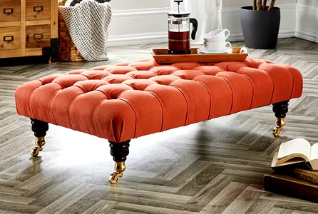
There’s still room for color, just in a more understated way. Muted greens, faded blues and warm terracotta tones are all being used as accents rather than focal points. A cushion here, a throw there, maybe a piece of artwork. These small touches add personality without disrupting the calm feel of the room.
It’s a more relaxed way of decorating.
Why This Trend Feels Like It’s Here to Stay
Some trends come and go quickly, but this one feels a little different.
The shift toward softer color palettes in living room design isn’t driven by fashion alone. It’s driven by how people want to live. More comfortably, more naturally and with less pressure to constantly update their space. That’s why it feels less like a passing trend and more like a long-term change.
Softer color palettes have a way of transforming a living room without making it feel overdesigned. They bring a sense of calm, balance and warmth that’s hard to achieve with stronger contrasts. And once you start layering tones, textures and natural materials, the space begins to feel more personal.
It’s not about creating a perfect room. It’s about creating one that feels right when you walk into it.
If you’re looking to bring this look into your home, a well-crafted Chesterfield can anchor the space beautifully. Explore the handcrafted collection at Distinctive Chesterfields and browse pieces designed to complement both classic and modern interiors.
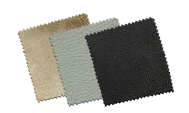
Five samples, posted free Order your swatches
Screens lie about color. Order five leather or fabric swatches and see them in your own light before you spend anything.